Few tools are as ubiquitous in digital marketing as Google Data Studio. It’s simple to use, getting better and better every day, and free to boot.
Yet, as much as we at Hedy & Hopp have grown to appreciate sharing data and insights using Data Studio, we have never felt like any Data Studio dashboards are completely up to our standards. As a tool, it has some serious weaknesses that have limited what we thought we could do. Over the last few months, we have worked hard to overcome these weaknesses, because ultimately Data Studio is our best option for creating digital marketing dashboards.
I can be a perfectionist in my work, and when it comes to visualizing data, I have very high standards. I love the ability to make highly customized reports and dashboards with tools like Tableau, Power BI, or Python. Not only can you make very complex concepts easy to interpret, but these tools also allow you to customize the visual experience.
There were a few issues that made us at Hedy & Hopp wary of using Data Studio for a long time. Not only were we stuck with fewer options for visualizations, but it has limited data processing and a page-by-page format that was not very interactive.
We wanted to move away from Data Studio. But it has one powerful strength. It has a very low barrier to entry. Like crazy low.
Data Studio’s Strengths Outweigh Its Weaknesses
All of those other tools require some level of training. I can’t imagine anyone outside of our Decision Science team using Python, and we have worked with very few clients that have even used Power BI or Tableau.
Not only do these tools require you to learn their system, but they also have their own logins. Power BI’s complex user system is amazing for highly sensitive information but is generally overkill for Google Analytics and Google Ads data. Only our most data-savvy clients, with very complex data models, are using Power BI.
Data Studio is the opposite. All you need is a Google account to access and the interface requires very little training. If you can use a banking app on your phone, you would have zero problems using Data Studio in seconds.
Because it is so easy to use, it really expands our audience to practically anyone. This single feature makes Data Studio an awesome tool. If your audience can’t see your insights, it does not matter how powerful your tool is.
So, we decided we would tackle the biggest issues we have working with Google Data Studio.
- It works more like a slideshow than an app
- It doesn’t have the visualizations we need
- It can’t make complex data models
#1 Make Data Studio Feel Like An Application
When you use your bank app or Instagram, you don’t click from page-to-page. It is not a slideshow. You use the navigation to get to where you need.
In Data Studio, the default navigation is not intuitive and feels more like you are clicking through slides or pages in a book. Not only that, but it can be hard to find a specific page without clicking a dropdown.

If you are using Data Studio to build a report, and you are telling a story in a specific order, I think this feature is great.
The second option is to move the navigation to the left. This is actually not so bad, and it feels a lot more like an application. We thought this would be a good alternative, but it also has some weaknesses.
First, it has no hierarchy. So, all pages are treated equally. This is not bad if you have a few pages, but it can get out of hand in a hurry. If you have 10 or more pages, the left navigation gets quite large. Not only that, but it can be hard to identify subpages.
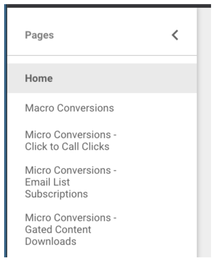
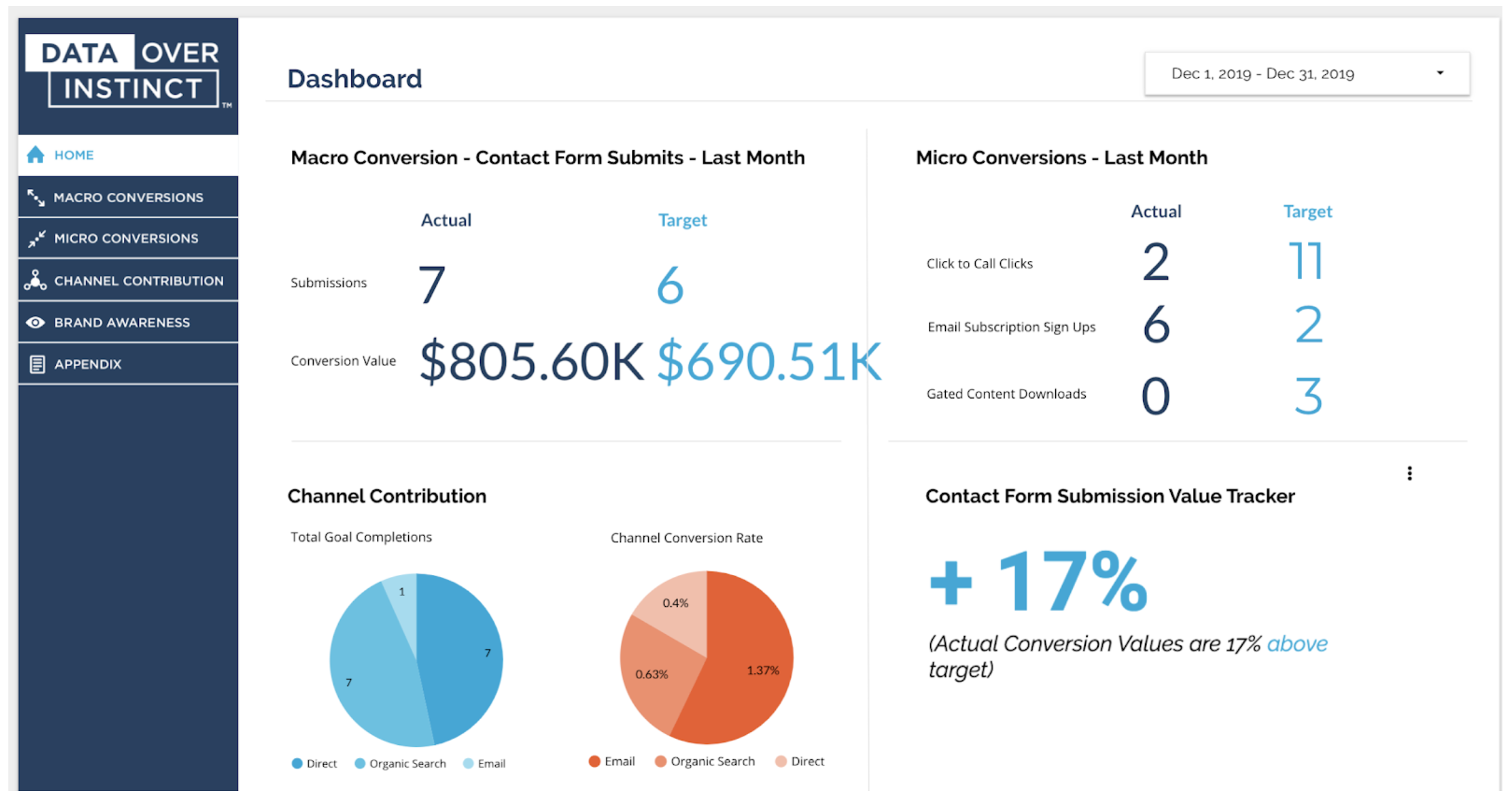
Our solution was to build our own left-side navigation that uses the common conventions of standard navigation setups. Plus it looks nice!
In addition to having top-level navigation, we used tabs to create secondary navigation when needed.
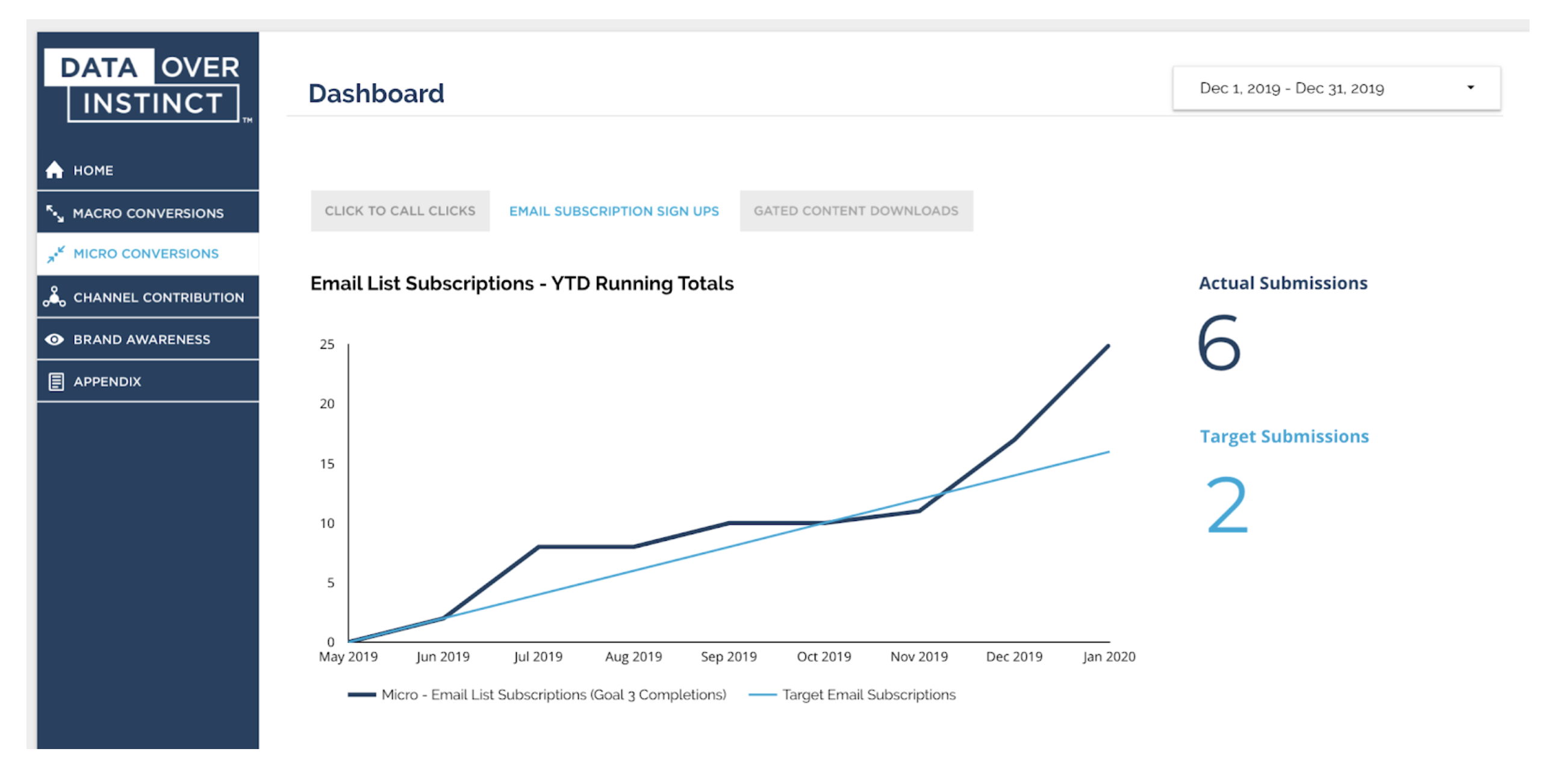
In order to make this navigation, we used a few different design elements including images that look like text, but the most critical part of the process is what we do before we build anything.
The first thing we do is design a sitemap. This allows us to identify all of the key pages we want to include and how they are connected.

From there, we review with all of the primary stakeholders to make sure we have covered the key information needed. This allows us to build our dashboards a lot faster.
#2 We Created Our Own Visualizations
We also love the new Community Visualization tool in Data Studio. It allows us to build any type of visualization we want, and it can bind to any user’s data.
We loved this feature so much, we worked with the Data Studio team at Google to have two of our custom visualizations be featured in the community visualizations gallery in Data Studio.
If you would like to use our statistical significance tool “Stats Analyzer” or the “Data Target Card,” you can access them in any report in a few simple steps.
- Make sure your data allows for community visualizations
- Click the community visualization icon in the top navigation in Data Studio
- Click the “+ Explore more” button to use our tools
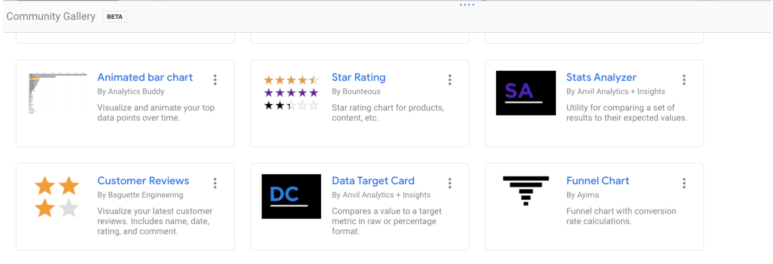
Not only can you find the two tools we built, but there are more than 20 others in the gallery from companies like Supermetrics, Bounteous, or even the great developers at Google Data Studio like Yulan Lin.
#3 Working with Relational Data
One of the biggest differences between Data Studio and other business intelligence tools is that it does not have robust features for handling relational data. A few years ago they created the blended data feature, but it is not nearly at the level of what something like Power BI can do using Microsoft Power Query.
That being said, there are a few strengths of Data Studio when it comes to modeling data. The biggest is with Google Analytics data.
With most tools, you have to pull in Google Analytics from multiple API requests and build that into a single relational data set. With Data Studio, that is all done for you. All you have to do is connect to Google Analytics, and your data is modeled. This is really amazing if you are working with a lot of web analytics data.
The second integration that helps us a lot is Google BigQuery. Data Studio has a very simple way to connect to data in BigQuery, and this has been a powerful tool for us to really make the most of the application.
For instance, BigQuery allows you to leverage SQL and to create views, so we have created some complex models in BigQuery and then pulled in a view where the data has already been distilled down to a single table.
This is really useful when we need to build customized attribution models for our clients. We can pull in different resources, like Google Analytics and CRMs like Salesforce, to create linear and even more complex models customized to the client’s business.
Overall, we love working with clients that are using Data Studio, because it means stakeholders are looking at the data. As a data-driven company, that makes us very happy.
If you’re interested in learning more about how to use an attribution model for effective reporting in Google Data Studio, please get in touch!

